Skills
- Perform image management procedures.
- Demonstrate professional visual communication skills.
Resources:
Textbook: Adobe Photoshop CC: Classroom in a Book
Adobe TV: http://tv.adobe.com/
Online: http://impawards.com/ (Examples of Movie Posters)
“The Heart” Movie Poster
OVERVIEW
You are a graphic designer working for one of the large movie studios in Los Angeles. The studio is planning to release a film called “The Heart” this summer targeted to a variety of audiences. The studio needs ideas for this film, as well as designs for the posters used to advertise them.
The theme of this movie is open to your own interpretation. Anything goes (ie: horror, romantic, comedy, adventure, sci-fi, etc), the goal is to convey an idea of what the movie is about and to invoke interest in the viewer. You may use whatever style as well, painting, illustration, photography, photo manipulation, etc, or combinations of all. Our project is to design an original movie poster for the movie “The Heart.”
OBJECTIVE
Students will develop their compositional/layout skills by applying visual hierarchy principles to both imagery and typography components.
INSTRUCTIONS
1. Get inspired and research movie posters on the Internet. Look at the different components movie posters provide.
2. Start brainstorming for your Poster. Determine the movie genre, actors/actresses, movie rating, credits, tagline, images/graphics, etc.
3. Develop a proposal on a sheet of paper that contains:
- Plot Summary: Plan out the basic parts of your film before starting your design. One paragraph including Genre, Title, Tag Line, Plot, Rating, Opening Date, and Characters. List the credits for your film.
- Sketches: Draw 3 sketches to brainstorm ideas and layouts.
- Inspiration: Include three movie posters that you like that are in your movie poster genre.
4. Start developing your movie poster in Photoshop.
5. Create a new 11×14 canvas that is 300ppi and in CMYK color mode.
6. Create and Design. Use the requirements below to make sure you include all of the necessary components:
- imagery you develop in Photoshop must help support the idea behind the movie
- movie title
- tag line –(provides more information on the movie besides the title alone)
- opening movie date
- Actors & Actresses (at least 2)
- Credit / Billing block
- Studio Logo (Paramount Logo provided)
- MPAA rating (G, PG, PG-13, R – provided)
7. Save the project, with layers, as a Photoshop .psd called: MoviePoster_(YourInitials)
8. Flatten the file and save it as a .JPG for submission.
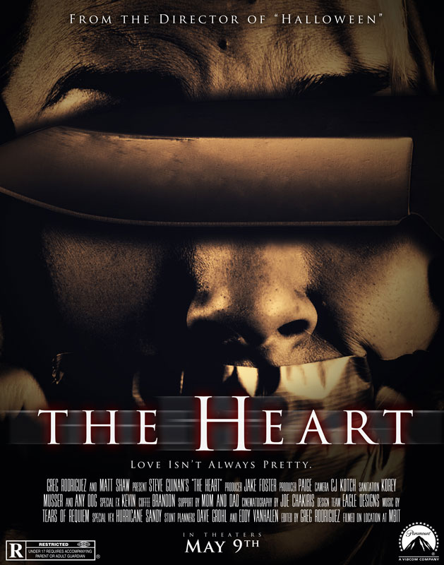
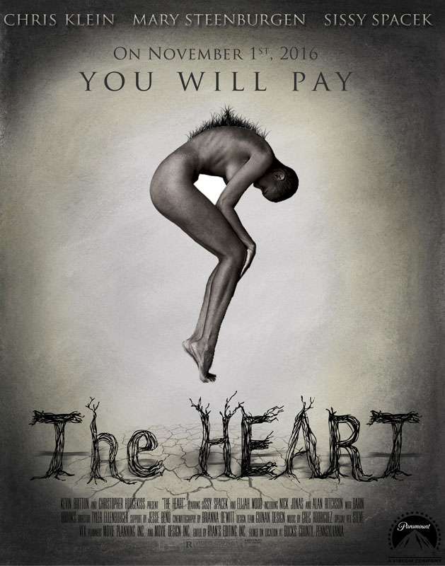
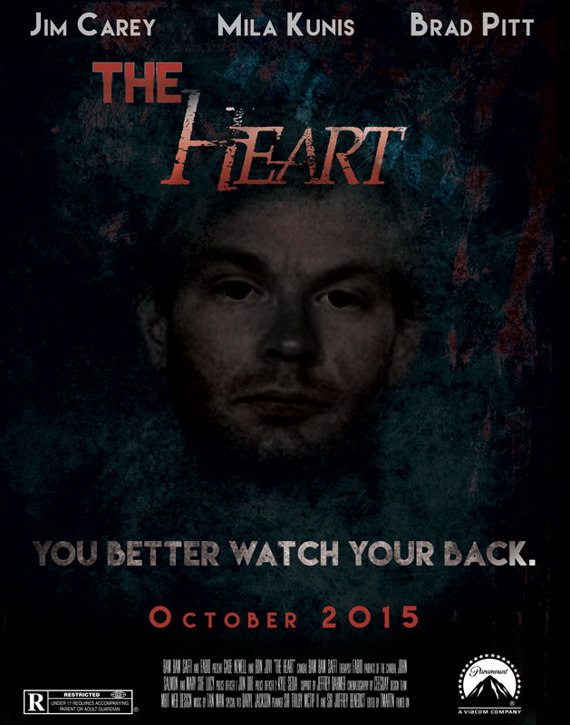
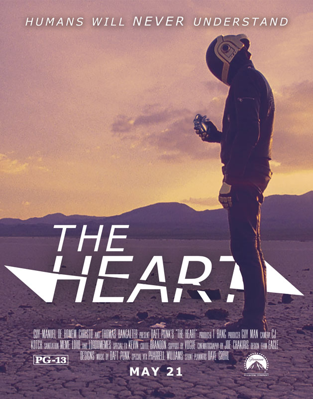
EXAMPLES
ASSESSMENT
You will be graded according to the following criteria on the rubric below.
| Category | Outstanding | Meets Expectation | Below Expectation | Unacceptable | Total |
| Creativity
(10pts) |
Several of the graphic elements and/or images used in the project reflect an exceptional degree of student creativity in their assignment. | Some of the graphic elements and/or images used in the project reflect student creativity in their assignment. | The ideas were typical rather than creative. | The student did not really make or customize any of the items in the project. Elements were to basic. | |
| Skills
(10pts) |
Looks like the student has an excellent understanding of Photoshop and using the different tools when appropriate, | Looks like the student has a good understanding of Photoshop and using the different tools, but needs to practice more. | Student gave some effort. | Student gave very little effort in using Photoshop and the available tools. | |
| Graphics- Clarity
(5pts) |
Graphics are all in focus and the content is easily viewed and identified. | Most graphics are in focus and the content is easily viewed and identified. | Most graphics are in focus and the content is easily viewed and identified. | Many graphics are not clear or are too small. Graphics are blurry or pixelated. | |
| Graphics- Relevance
(5pts) |
All graphics are related to the topic and make it easier to understand. | All graphics are related to the topic and most make it easier to understand. | Some graphics relate to the topic. | Graphics do not relate to the topic. | |
| Text
(5pts) |
Text is appropriately placed and is stylized in an appropriate manner. The text style fits the design and composition of the poster. | Text is laid out in an appropriate manner. Text needs some work to make it fit in the design. | Text needs work but fits with the design concept of the poster. | Text is not placed correctly and is stylized in an immature manner. | |
| Attractiveness
(5pts) |
The poster is exceptionally attractive in terms of design, layout, and neatness. The finished product shows exact care with each element. | The poster is attractive in terms of design layout and neatness. | The poster is acceptably attractive though it may be a bit messy or could have been improved with a few more hours of work. | The poster is distractingly messy or very poorly designed. It is not attractive. | |
| Project Proposal
(5 Pts) |
The poster proposal is complete with a sufficient amount of information is your plot summary. Also 3 sketches are included along with 3 inspirational posters. | Your poster proposal is almost complete but missing one item. | Your poster proposal is incomplete because it is missing more than one item. | No poster project proposal was submitted. | |
| Time Management
(5pts) |
Student always uses classroom project time well. Conversations are primarily focused on the project and things needed to get the work done and are held in a manner that typically does not disrupt others. | Student usually uses classroom project time well. Most conversations are focused on the project and things needed to get the work done and are held in a manner that typically does not disrupt others. | Student usually uses classroom project time well, but occasionally distracts others from their work. | Student does not use classroom project time well OR typically is disruptive to the work of others. | |
|
Total: 50 Points |
|||||


