
Skills
- Perform image management procedures.
- Demonstrate professional visual communication skills.
- Use tools and commands to create and edit basic shapes
- Use rulers and smart guides as drawing aides
- Arrange content
- Demonstrate an understanding of vector drawing concepts
- Draw and edit curved and straight lines
- Create, edit, and paint with colors using a variety of color methods
- Create area and point type
Resources:
good.is – Tons of infographics
http://visual.ly – Even More Infographics
Creative Bloq: 100 Best Infographics
Infographic Project
OVERVIEW
An infographic is meant to present information – statistical, chronological, or other data – in such a way as to engage the viewer and to provide a more interesting method of relaying information than a list of facts and figures. The design needn’t necessarily be a series of exact graphs and diagrams; it does, however, need to compel the viewer to continue reading. Infographics typically relay a large amount of information, so you must keep the attention of the viewer long enough to impart your message.
The focus of your piece should be the information you’re presenting. The graphic elements that you will create (other than backgrounds, bars, etc) are there to display that information, not to simply adorn it. If you can do both at once, that’s a plus.
OBJECTIVE
Using Illustrator, create an infographic to distill information in order to quickly, efficiently, and visually convey a message (or argument) to an intended audience.
INSTRUCTIONS
- Begin researching the concept and style of your piece. You should explore several approaches so you’re sure to have a concept for which you can compile and create enough material. Discuss with instructor for guidance and approval of your general concept. There isn’t an exact amount of information that is required; this will differ based upon your approach, which is why you must discuss what you’re planning and ensure there’s enough information present to fulfill the project.
- Create a FACT SHEET in Word. You need to collect information to create the infographic. In Word type out factual information that you would potentially use in your graphic.
- Use the Internet to find factual information on your subject matter.
- Group your factual information into categories. (Categories that you would use on your graphic)
- Cite your sources
- Create a FACT SHEET in Word. You need to collect information to create the infographic. In Word type out factual information that you would potentially use in your graphic.
- After you have all the content for your Infographic begin gathering imagery you may need.
- Begin the design of the Inforgraphic by creating your working file in Illustrator. See Requirements below. Continue to seek and take feedback from peers and instructor as you work on your project to completion. Be sure to follow the project requirements below.
- Be sure to include all of your sources at the bottom of your Infographic in a pleasing manner.
- Save your file as infographic_(your initials) and submit your assignment in the Network drive as an Illustrator file.
REQUIREMENTS
- CMYK Color Mode
- 10 – 12 inches wide (height will vary according to your design)
- Good balance of graphic and textual presentation of information
- Strong typographical hierarchy
- Content that is textually rich but not unappealing
- At least 1 graphic representation of information (like a bar graph or pie chart), but probably more
- A roughly equal balance of imagery and type content. If your type is treated as graphic information, then the balance will wing a bit of course
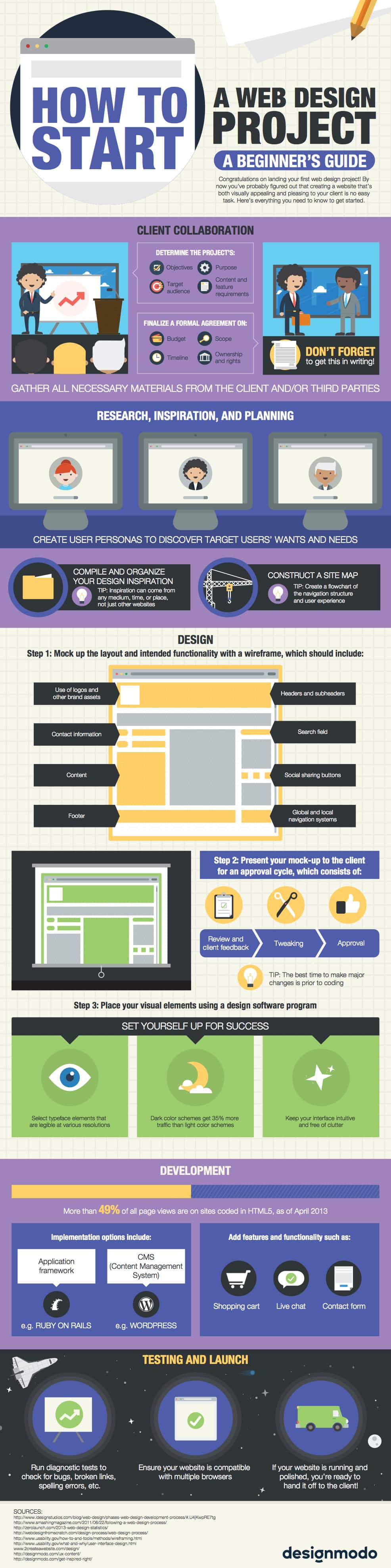
EXAMPLES


ASSESSMENT
You will be graded according to the following criteria to earn a total of 50 points:
| Exceeds Expectations (5 Pts) | Meets Expectations (3-4 Pts) | Needs Work (1-2 Pts) | |
| Topic | The topic of the infographic is specific in nature and is intended to inform or convince the viewer. | The topic of the infographic may be a bit too broad to allow the viewer to understand the main points. | The topic of the infographic is hard to ascertain and needs to be made more specific. |
| Type | The type of infographic chosen (i.e. timeline, informational, etc.) highly supports the content being presented. | The type of infographic chosen represents the content being chosen but another type may lead to more clarity for the viewer. | The type of infographic chosen does not convey the information well or support the content being presented. |
| Objects | The objects included in the infographic are repeated to support various data points and to make it easier for the viewer to understand the infographic. | Some objects included in the infographic are repeated but the infographic did not seem to include enough repeated elements to make it understandable. | Too many different types of objects are used in the infographic and that makes it hard for the viewer to understand the content. |
| Data | The data visualization formats chosen make the data presented easy for the viewer to understand the information. | The data visualization formats chosen showcase the data, but some may make it difficult for the viewer to understand the points. | Other data visualization formats should be chosen to best showcase the data presentation for the viewer. |
| Fonts | The infographic includes an appropriate font to both complement the content and make the text readable. | The infographic includes multiple fonts and/or the fonts do not seem related to the infographics topic. | The font(s) used in the infographic make the text almost unreadable. |
| Color | The color choices enhance the visibility of the infographic. Different saturations of the same color are used wisely. | The color choices are fine, but too many colors may have been used. | The color choices for the infographic are not visually pleasing and detract from the infographic. |
| Layout | The layout of the infographic adheres to the inverted pyramid style – main point on top, secondary point next, and supporting details at the bottom. | The layout of the infographic includes all three components – main point, secondary point, and supporting details – but is not organized in the inverted pyramid style. | The infographic is lacking one or two of the components of good infographic design – main point, secondary point, or supporting details. |
| Information Organization | The infographic utilizes one of the LATCH (location, alphabetical, timeline, category, or hierarchy) information organization formats to allow the viewer to understand the information in the infographic. | The infographic utilizes some components of the LATCH (location, alphabetical, timeline, category, or hierarchy) information organization formats, but the cohesiveness of the information presentation is lacking. | No information organization choice (location, alphabetical, timeline, category, or hierarchy) is present in the infographic. |
| Citations | Full bibliographic citations for all sources used are included. | The URL of sources used are included. | No citations to sources used are included. |
| Time Management | Project was turned in on time and classroom time was used effectively. | Project was not turned in on time and classroom time was not used effectively. |