
Chapter 9: Media Queries and Responsive Design
Goals for this Lesson
- Insert and edit media queries
- Design for different screen sizes
- Understand the scrubber
- Create styles for different screen sizes
Exercise
Instructions
- Download the file needed here. Create a new site for the project in Dreamweaver: Call the site: Ch 9 Exercise. Be sure to link the root folder and the images folder.
- Open the index.html file in Dreamweaver.
- In the css.css file add a style for all images that give them a max-width of 100%.
- Delete the width and the height from all three images.
- Add a max-width breakpoint at 768px and 600px in the css.css file.
- Designing for tablets at 768px:
- Give the logo image in the header a class called “logo” and in the 768px breakpoint give that class a width of 90%
- Select the h1 heading in the main and in the 768px breakpoint give that h1 a style to text-align center.
- Select the .section2 unordered list and in the 768px breakpoint give that .section ul a margin of Zero.
- At the 768px breakpoint style the h2 to have a text color of #4A7ABE.
- Scrub through the breakpoints to see how things change.
- Designing for small devices at 600px:
- At the 600px breakpoint give the logo class a width of 95%
- At the 600px breakpoint style the nav to have a white background
- At the 600px breakpoint style nav ul to have margin and padding of zero.
- At the 600px breakpoint style the nav ul li to float: none, have a top and bottom margin of .5em, and have a background color of #4A7ABE.
- At the 600px breakpoint style the class called “section1” to have a width of 100% and float:none.
- At the 600px breakpoint style the class called “section2” to have a width of 100% and float:none.
- Give the students.jpg image a class called “students“. At the 600px breakpoint style the class of students to display: none.
- At the 600px breakpoint style the .section ul to have a margin-left of 20px.
- Scrub through the breakpoints to see how things change.
- Save all the files.
- Submit the Ch9Exercise folder in the Shared Drive. It should include the CSS, Images, and html files in order to work properly.
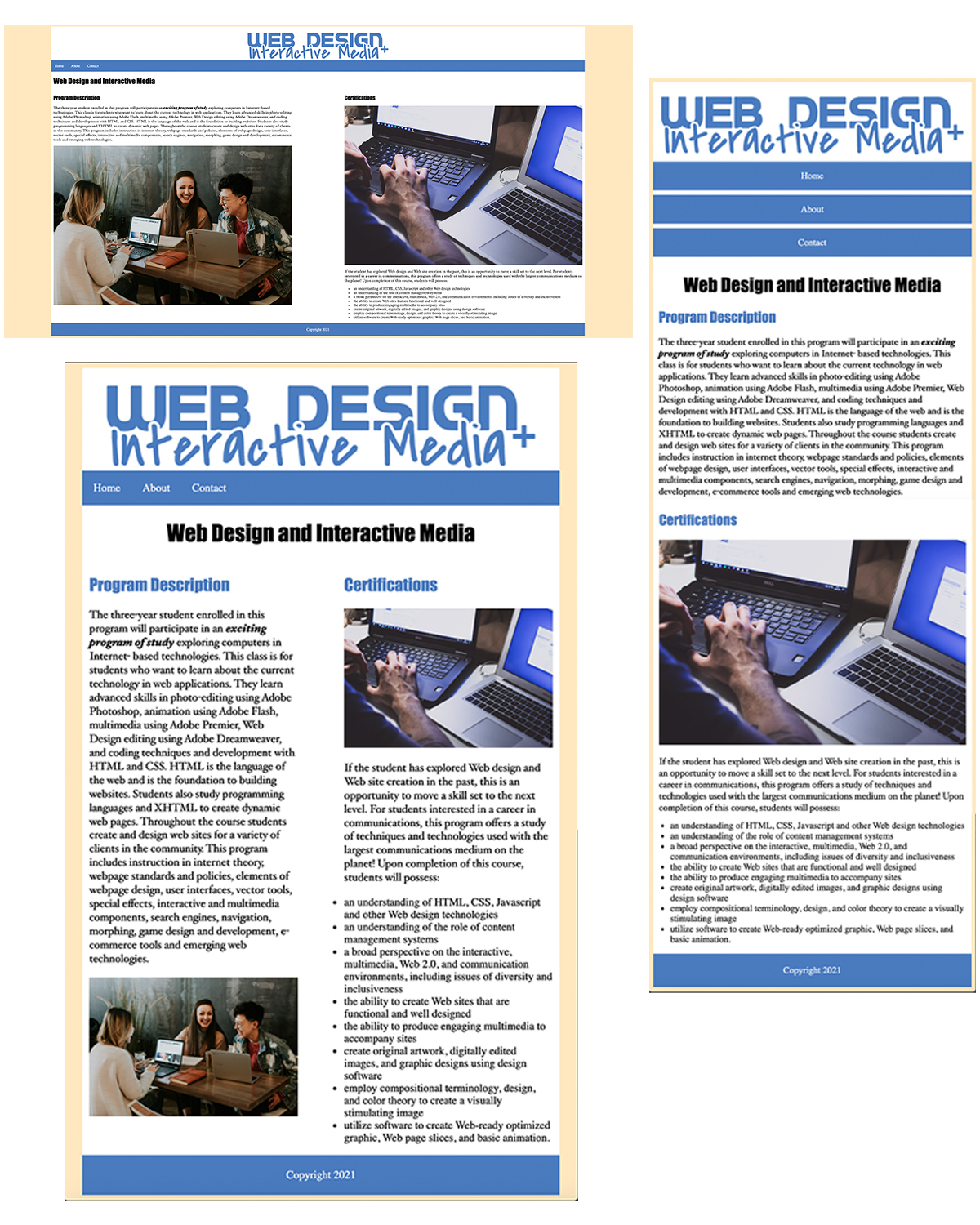
Chapter 9 Exercise Example